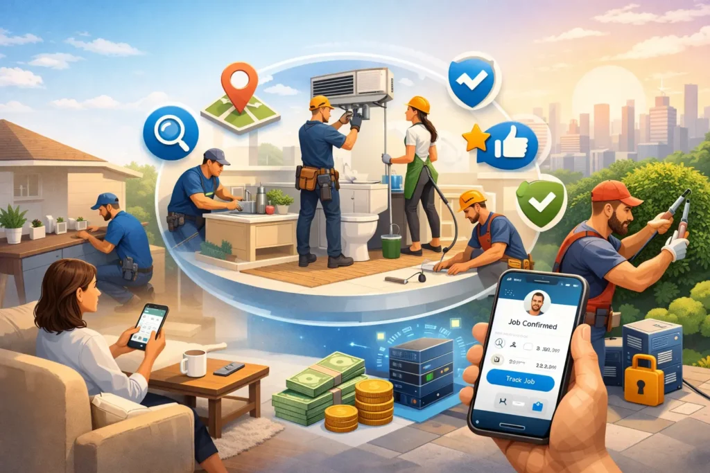


Ever tried sending a 2GB video file to your editor while running late for a pitch meeting, only to discover the file failed — again? Welcome to the maddening maze of flawed file transfer services. For startups, creators, and digital hustlers who live and breathe deadlines, bad UI/UX in file sharing isn’t just annoying — it’s a deal-breaker.
Whether you’re building the next WeTransfer clone or simply integrating quick file drop features into your workspace app, one misstep in user interface or user experience design can snowball into broken trust, churn, and one-star reviews. In a digital world where people expect Netflix-like smoothness and Uber-level intuitiveness, your product has no room for friction.
At Miracuves, we’ve helped launch scalable, monetizable app clones for clients who demand performance, clarity, and trust — especially in high-stakes platforms like file transfer services. Let’s dive into the biggest UI/UX blunders and how to steer clear of them.
Read more: How to Start a File Transfer Service Platform Business
Over-Complicated Interfaces (A.K.A. Button Soup)
You know those apps that look like someone dumped a control panel onto your phone screen? File transfer services often try to cram everything — encryption options, folder hierarchies, device syncs — into the main screen. Bad move.
A clean, minimalist interface with progressive disclosure (only showing advanced options when needed) is the gold standard. Users need a simple “upload → send → done” flow.
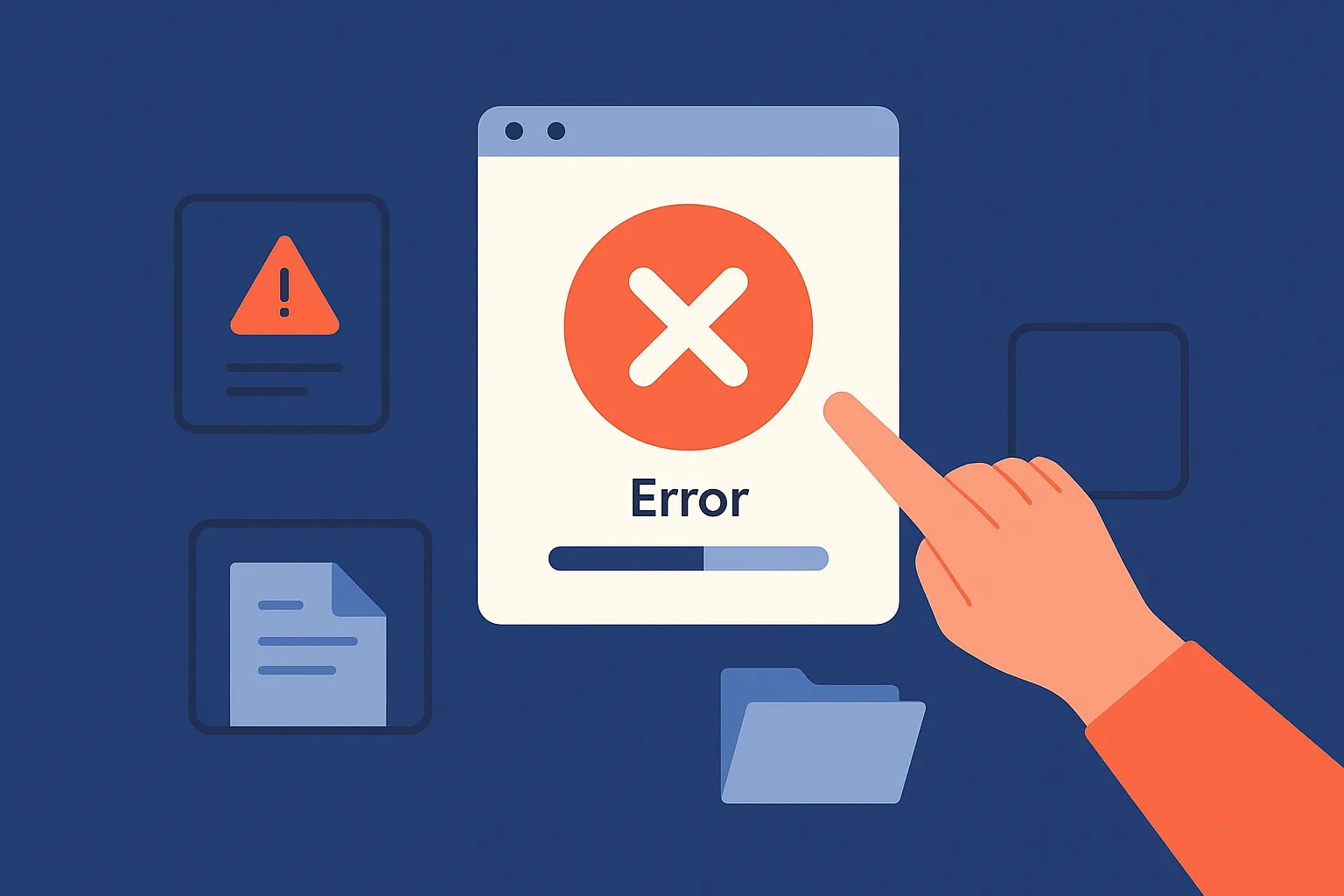
Lack of Feedback Loops
Imagine uploading your quarterly investor pitch deck and… silence. No progress bar. No success tick. Nothing. It’s like throwing your file into the void and hoping for the best.
Lack of UI feedback destroys user confidence.
Must-Have UI Elements:
- Upload progress indicators (preferably visual + percentage)
- Confirmation pop-ups (“Your file has been sent to Alex”)
- Error states with helpful recovery options
Connotation to Emphasize: Reassurance. Make your users feel like your app’s got their back.
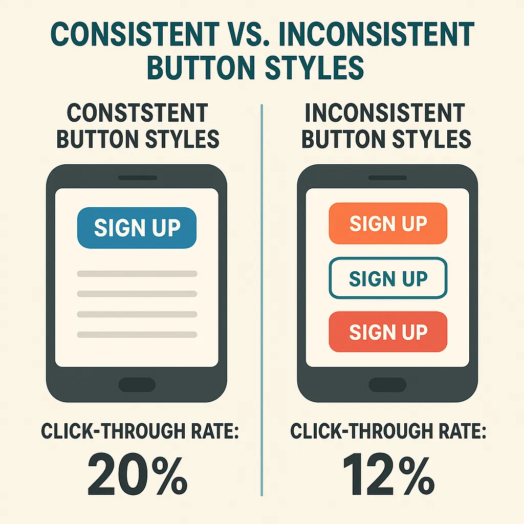
Inconsistent Design Language
One screen has rounded buttons, another uses sharp edges. Colors don’t follow a consistent palette. Typography jumps from Arial to Roboto like it’s on Red Bull. Inconsistency is chaos.
Why It Matters: A consistent design system makes your product easier to use. It trains the user’s eye and builds subconscious familiarity. A jarring design makes them work harder — and nobody wants more work from a productivity tool.
Ignoring Mobile UX (Still?!)
It’s 2025, and yet some file-sharing tools are still desktop-centric. But let’s be real — creators, influencers, marketers, and devs alike all juggle files from their smartphones while on the move.
Common Offenders:
- Buttons too small for thumbs
- No drag-and-drop or swipe gesture support
- Desktop modals shoved into mobile layouts
Hypernymal Context: File transfer platforms are part of the broader productivity app ecosystem — and mobile-first is the norm here.
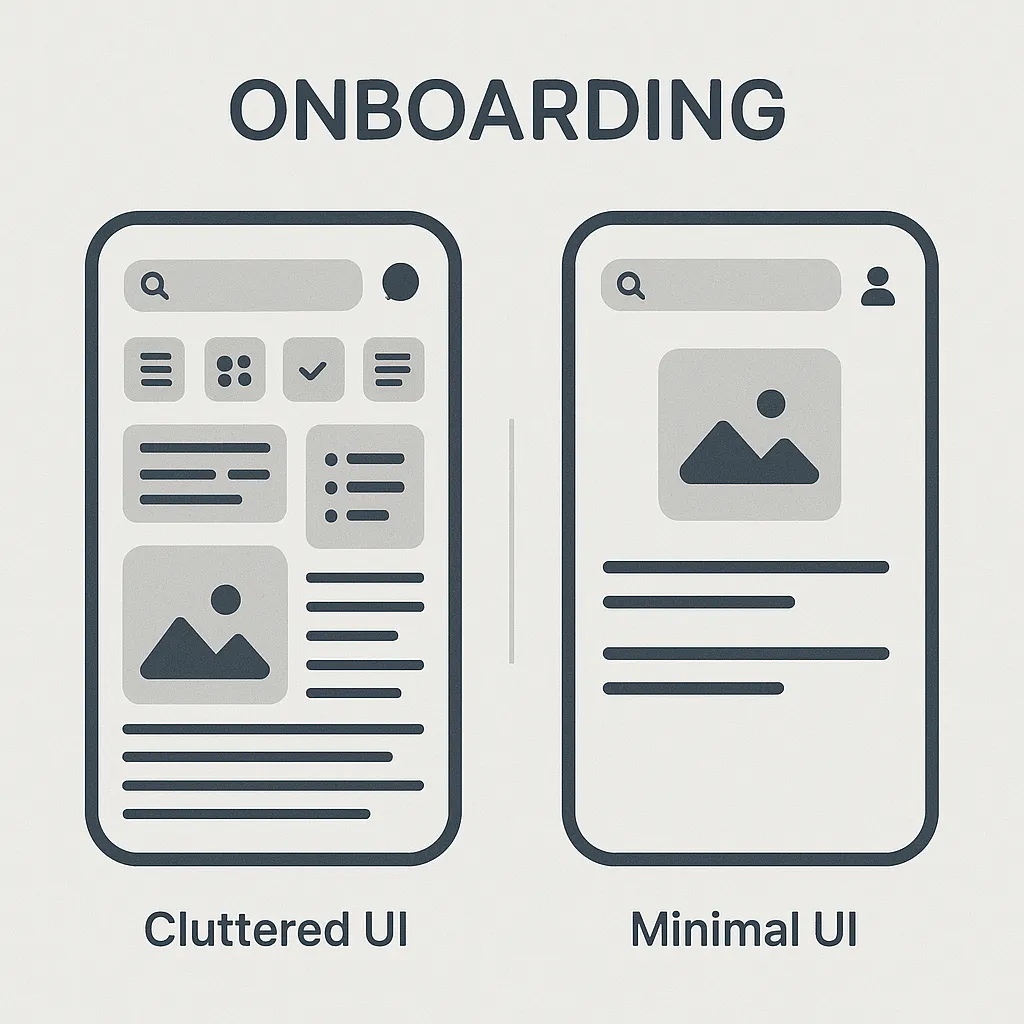
Weak Onboarding (Or None at All)
First impressions matter. You can’t just drop new users into the dashboard and expect them to “figure it out.” Especially not when your platform involves sensitive tasks like encrypting client documents or syncing devices.
Best Practice: Offer a short, skippable walkthrough — ideally contextual, not just a dull carousel of screens.
UI Pattern to Include:
- Tooltips
- Micro animations for guidance
- One-time prompts for feature highlights
Poor File Visibility and Navigation
Where did that PDF go? Was it uploaded? Sent? Still in drafts?
If users can’t quickly locate files or review recent transfers, they’ll assume it’s broken — or worse, not trustworthy.
Add These Elements:
- Transfer history panel
- File preview
- Clear labels: “Sent,” “Pending,” “Received”
Think of it like Instagram’s “Activity” tab — people want to see what happened and feel in control.
Loading Times That Make You Question Life Choices
Speed is UX. No amount of pretty icons can make up for sluggish upload/download performance.
Antonymal Layering: If your app feels “slow,” it’s the opposite of “intuitive.” Nobody praises beautiful delays.
What You Can Do:
- Show partial uploads for large files
- Allow background transfers
- Integrate CDN + edge caching strategies (especially for mobile)
According to Statista, global mobile download speeds increased 26% YoY — users expect apps to keep up.
No Personalization or Smart Defaults
Every user shouldn’t start from scratch. If someone uploads design files every week to the same Slack channel or contact, your app should remember that.
Smart UX Ideas:
- Suggested contacts
- Recent folders
- Default file format settings
Collocation Example: “Set it and forget it” — that’s what smart UX feels like.
Zero Focus on Accessibility
Can people with visual impairments use your app? What about dyslexic users, or those navigating with screen readers?
Too many developers treat accessibility as an afterthought — but it’s not just good karma, it’s good business.
Accessibility Checklist:
- Text contrast ratio of at least 4.5:1
- Alt-text for all file types
- VoiceOver/Screen Reader support
- Keyboard navigation
Holonym Insight: Accessibility is a part of the broader inclusive design system — which mirrors your brand’s values.
Read more: Best WeTransfer Clone Scripts in 2025: Features & Pricing Compared
Conclusion
UI/UX isn’t just about what looks good — it’s about what feels right. If your file transfer service leaves users confused, anxious, or just plain irritated, they won’t stick around. Fixing these design potholes isn’t optional — it’s your fastest path to growth and love from your users.
And here’s the real kicker: with smart cloning solutions from Miracuves, you don’t have to build everything from scratch. You get high-performance, customizable file transfer platforms that are fast, scalable, and ready to monetize.
At Miracuves, we help innovators launch high-performance app clones that are fast, scalable, and monetization-ready. Ready to turn your idea into reality? Let’s build together.
FAQs
Q:1 What’s the most common UX mistake in file transfer apps?
Cluttered interfaces. Users want clarity, not complexity. If they can’t figure it out in 30 seconds, you’ve already lost them.
Q:2 How important is mobile optimization for file transfer tools?
It’s critical. A huge chunk of users will access your service via smartphones or tablets — ignore mobile, and you alienate half your audience.
Q:3 Should file previews be a default feature?
Yes. Users often want to confirm the content before sending. A preview option improves confidence and reduces errors.
Q:4 Can dark mode impact UX positively?
Absolutely. Especially for professionals working late or using AMOLED screens — dark mode isn’t just aesthetic, it’s functional.
Q:5 What tools help design better file-sharing UX?
Use Figma for wireframes, Hotjar for heatmaps, and Maze for user testing. Don’t guess what works — watch users interact.
Q:6 Is user onboarding really that necessary?
Yes, especially in apps involving encryption, syncing, or bulk transfers. A good onboarding flow boosts retention and lowers support tickets.
Related Articles: