
If you’ve ever tried to send money abroad using a mobile app and felt like you needed a PhD in navigation just to complete the transfer, you’re not alone. Many international money transfer platforms are riddled with confusing flows, unclear fees, and design choices that feel like they were made in a vacuum. And for startups building the next-gen fintech solution? Well, UI/UX mistakes can be the silent killers of adoption and retention.
Let’s be honest—international remittances aren’t a new problem. People have been wiring money across borders since the telegram days. But the expectation now is radically different. Instant transactions, clean interfaces, upfront pricing—all with a dash of trustworthiness. And while platforms like Wise (formerly TransferWise) or Revolut get the UX spotlight, there’s still a swarm of apps that fall short, especially in cross-border flows.
So, whether you’re a founder creating the next Venmo-for-globe-trotters or a startup planning to white-label a transfer app, this blog post unpacks the most common (and costly) UX blunders. And yep—we’ll also show you how Miracuves helps turn these pain points into opportunities.
Read more: How to Develop an International Money Transfer App
The Costly Pitfalls of Poor UI/UX in Cross-Border Transfers
1. Overwhelming Users with Cluttered Dashboards
You open the app to send money and BAM—you’re hit with a maze of numbers, exchange rates, historical graphs, buttons labeled “Send,” “Quick Send,” “Instant Transfer,” and “FX Locker.” What do you tap first?
Why it hurts: A cluttered UI confuses users, especially first-timers or non-tech-savvy audiences. In fintech, clarity equals trust.
Better approach: Start with a clean layout. Prioritize the main action—Send Money—and hide the extras under “More” or in advanced settings.
2. Hiding or Confusing Fee Structures
No one likes surprise charges—especially when they’re buried three screens deep in the app. Fees that appear after the money is sent are UX betrayals in disguise.
Why it’s a UX fail: Users abandon platforms that feel sneaky or dishonest. Transparency builds credibility—non-negotiable in financial products.
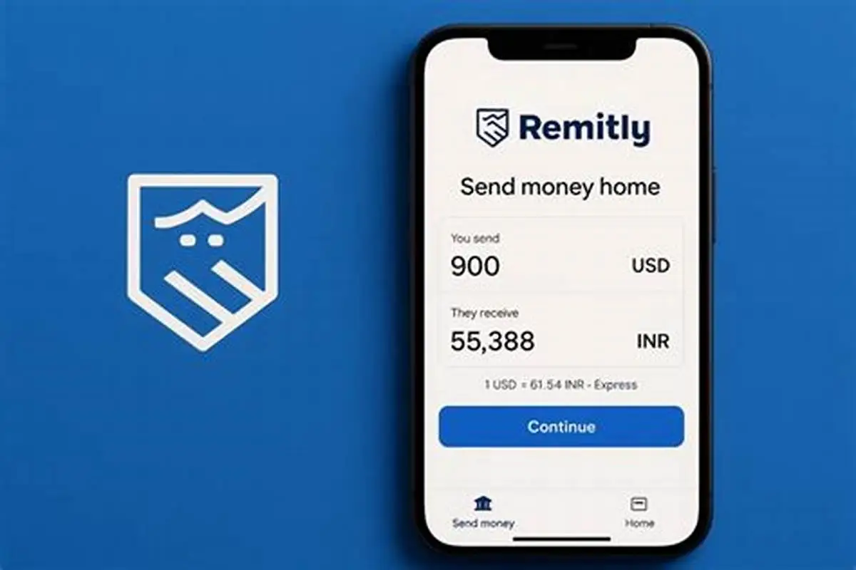
Real-life scenario: Imagine a user trying to send $500 to India. The app shows $500 leaving but doesn’t clearly mention that the recipient gets $470 until the last screen. That’s friction.
Quick fix: Visualize fees in real-time. Use sliders or side-by-side views showing: “You send $X → Recipient gets $Y.”
Stat to back it up: According to Statista, transparency in pricing is a top factor influencing app choice for 68% of remittance users.
3. No Localization or Poor Language Support
English-only apps in a multilingual market? That’s a fast pass to user churn.
What’s the issue: Cross-border apps serve a global user base. If you’re sending money to rural Kenya or remote areas in the Philippines, your UX better speak the local language—and culturally, too.
Fix it: Implement smart localization. This isn’t just translation—it’s adapting UI, currency, time formats, and support content for different locales.
UX detail: Add a toggle to select preferred language on the home screen. Make currency symbols and flag icons intuitive, not abstract.
4. Ignoring Emotional Design in Stressful Contexts
Let’s not forget—sending money abroad often stems from necessity, not luxury. Emergencies, family support, tuition payments. UX in this space is emotionally charged.
Mistake: Cold, transactional interfaces that feel sterile and robotic.
Alternative: Infuse empathy. Show confirmation messages like “Your support is on the way,” or “Your transfer helps your loved ones thrive.” Include animations or visual cues that add warmth without slowing down performance.
Stat insight: Apps that employ emotional design improve user trust and loyalty by up to 23% (CB Insights).
5. Terrible Onboarding Flows
Your users shouldn’t feel like they’re opening a bank account in 1997 just to get started.
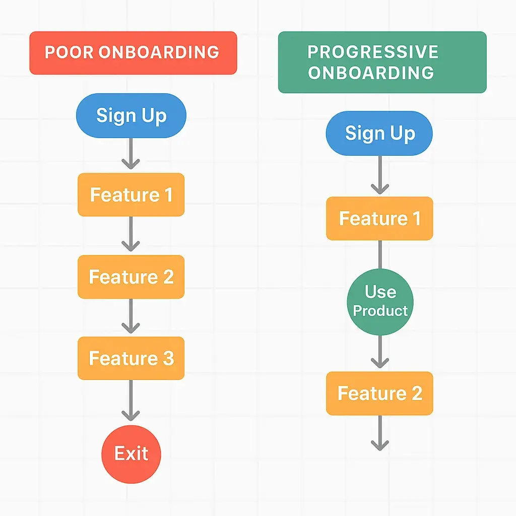
Where it fails: Asking for every document, ID scan, selfie, and reference before even seeing the home screen is a killjoy.
Better method: Break it into micro steps. Let users explore the app with limited features before full KYC. Use gamified progress bars and tooltips to reduce friction.
6. Lack of Real-Time Feedback or Notifications
“Did the money go through?” “Is it pending?” “Why is nothing happening?”
UX error: Silence. No alerts. No haptic feedback. No estimated delivery time.
Fix it fast: Use visual progress indicators. Push real-time updates: “Transfer received,” “Processing,” “Delivered.” Give a delivery ETA—even if approximate.
Consequence of ignoring: Your users open competing apps just to double-check.
7. Inconsistent Design Across Platforms
If your Android app looks like a spaceship and your iOS version feels like a retro calculator, you’re doing it wrong.
Impact: Inconsistent design creates brand distrust and slows down usability, especially for users switching devices or using web and mobile simultaneously.
Tip: Use cross-platform design systems like Material 3 or SwiftUI guidelines, adapted to your app’s branding. Test designs in Figma or Sketch across screens before pushing live.
8. No Support Within Reach
Imagine sending $2000 and the screen freezes. What now?
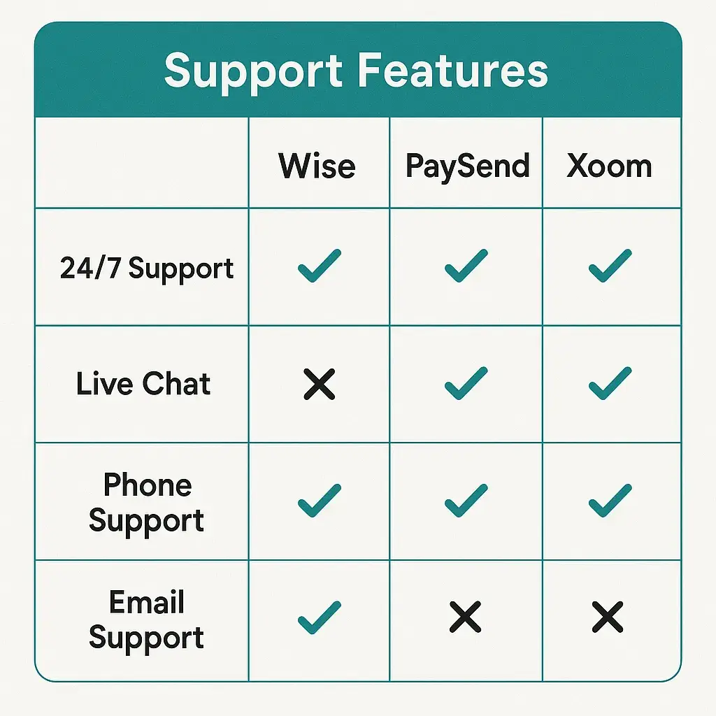
UX fail: Lack of in-app support or long-click journeys to FAQ pages.
Easy win: Add a floating chat icon or support tab on every page. Include an AI chatbot for basic issues and escalate to human reps seamlessly.
Read more: How to Market a International Money Transfer App successfully After Launch
Final Thoughts
User experience in the international money transfer space isn’t just about design aesthetics—it’s about trust, clarity, and human connection. When money moves across borders, people’s lives are affected. Your app’s UX should reflect that responsibility.
Emerging trends like biometric onboarding, AI fraud detection, and multilingual voice assistance are already shaping the next-gen remittance UX. Staying ahead of these can be your edge.
At Miracuves, we help innovators launch high-performance app clones that are fast, scalable, and monetization-ready. Ready to turn your idea into reality? Let’s build together.
FAQs
Q:1 What’s the biggest UX mistake in cross-border transfer apps?
Hiding fees or providing unclear cost breakdowns. Transparency is everything when money’s on the line.
Q:2 How important is localization in fintech apps?
Vital. If your users can’t read or relate to the interface, they won’t trust the app with their money.
Q:3 How can I make my onboarding less painful?
Break it into steps. Let users explore before demanding every document under the sun. Use progress bars and supportive language.
Q:4 Why is emotional design relevant in fintech?
Because money is emotional. Design that acknowledges users’ feelings builds loyalty and reduces churn.
Q:5 Should I include live support in my app?
Absolutely. Even a basic AI chatbot is better than nothing. People need reassurance when large sums are involved.
Q:6 Is it worth investing in UI/UX from day one?
Yes. A good-looking app won’t save a bad experience—but a great experience can grow your user base organically.
Related Articles:
Miracuves is an independent software development company. We are not affiliated with, connected to, sponsored by, or endorsed by any company or product named in this article.
Terms such as “X Clone” are used descriptively. It is how the software industry refers to building a platform with functionality comparable to a known service, and how clients search for it.
The entire design and codebase of our products is built by our own team. Our products contain no code, design, graphics, or content originating from any third-party website or applications.
All third-party names and marks referenced in this article are the property of their respective owners, referenced solely to identify the services discussed.