



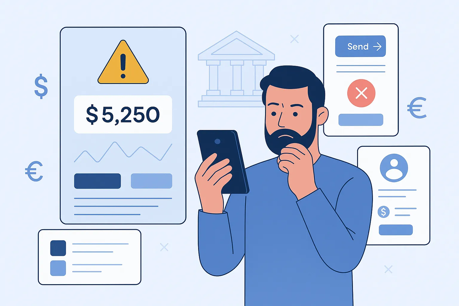
It’s a big day. You’ve just launched your shiny new digital banking app. The backend? Flawless. Security? Rock solid. But a week in, your users are bouncing faster than you can say “KYC.” What gives? Chances are, your UI/UX isn’t pulling its weight. And in fintech, where trust is everything, a clunky experience is the fastest way to lose it.
As creators, founders, and startup dreamers, we often get caught up in the tech. We obsess over compliance, encryption, integrations—and rightly so. But we forget that for the average user, it’s not the AI under the hood that builds trust—it’s how the app feels. The design. The layout. The intuitive flow from one task to the next. Fintech apps may handle millions, but it’s the micro-interactions that keep users coming back.
And here’s the kicker: fintech users don’t have patience. If they struggle to find their transaction history or can’t add a new payee without calling support, they’ll uninstall, leave a one-star review, and never look back. At Miracuves, we’ve seen this story play out too many times—which is exactly why we build clone apps that learn from these costly mistakes.
Read more: How to Start a Digital Banking App Business in 2025
The Silent Killers: Common UI/UX Pitfalls in Fintech Apps
1. Onboarding That Feels Like a Credit Check
First impressions matter—especially when you’re asking for sensitive data. Yet many digital banking apps treat onboarding like a bureaucratic chore. Lengthy forms, complex KYC steps, unclear progress indicators… it’s a recipe for churn.
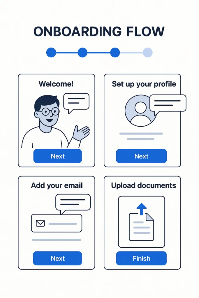
Break down onboarding into bite-sized stages. Use real-time validation. Add a progress bar. And for the love of UX, explain why you’re asking for each piece of info.
2. Visual Clutter and Data Overload
Banking data is dense—but users don’t want to feel like they’re reading a stock market ticker. Throwing graphs, balances, credit scores, and offers on the dashboard makes it feel chaotic, not empowering.
Example: A user just wants to check yesterday’s transfer. Instead, they’re hit with loan promos, recent news, and an animated pie chart of spending habits.
Fix It: Prioritize key actions. Use visual hierarchy. Let users customize their home screen widgets. Clean doesn’t mean empty—it means focused.
3. Missing Micro-Interactions = Missing Trust
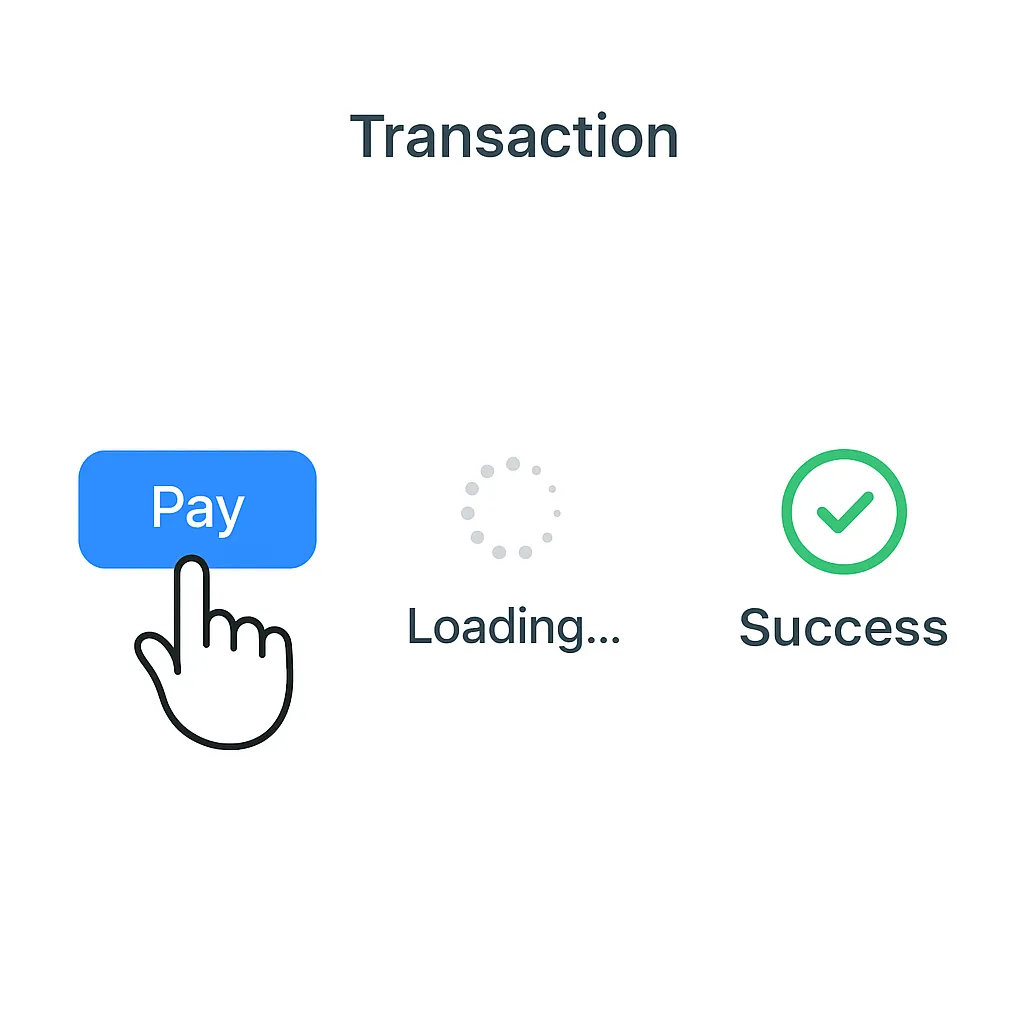
Ever hit “Send” on a money transfer and got zero feedback? It’s like shouting into the void. In fintech, this isn’t just bad UX—it’s a red flag. Users panic, repeat actions, and end up with duplicate transactions.
Solution: Use animations, loading spinners, success toasts, and soft haptics. Micro-interactions are the unsung heroes that reassure users their money’s in safe hands.
4. Poor Error Handling That Makes Users Feel Dumb
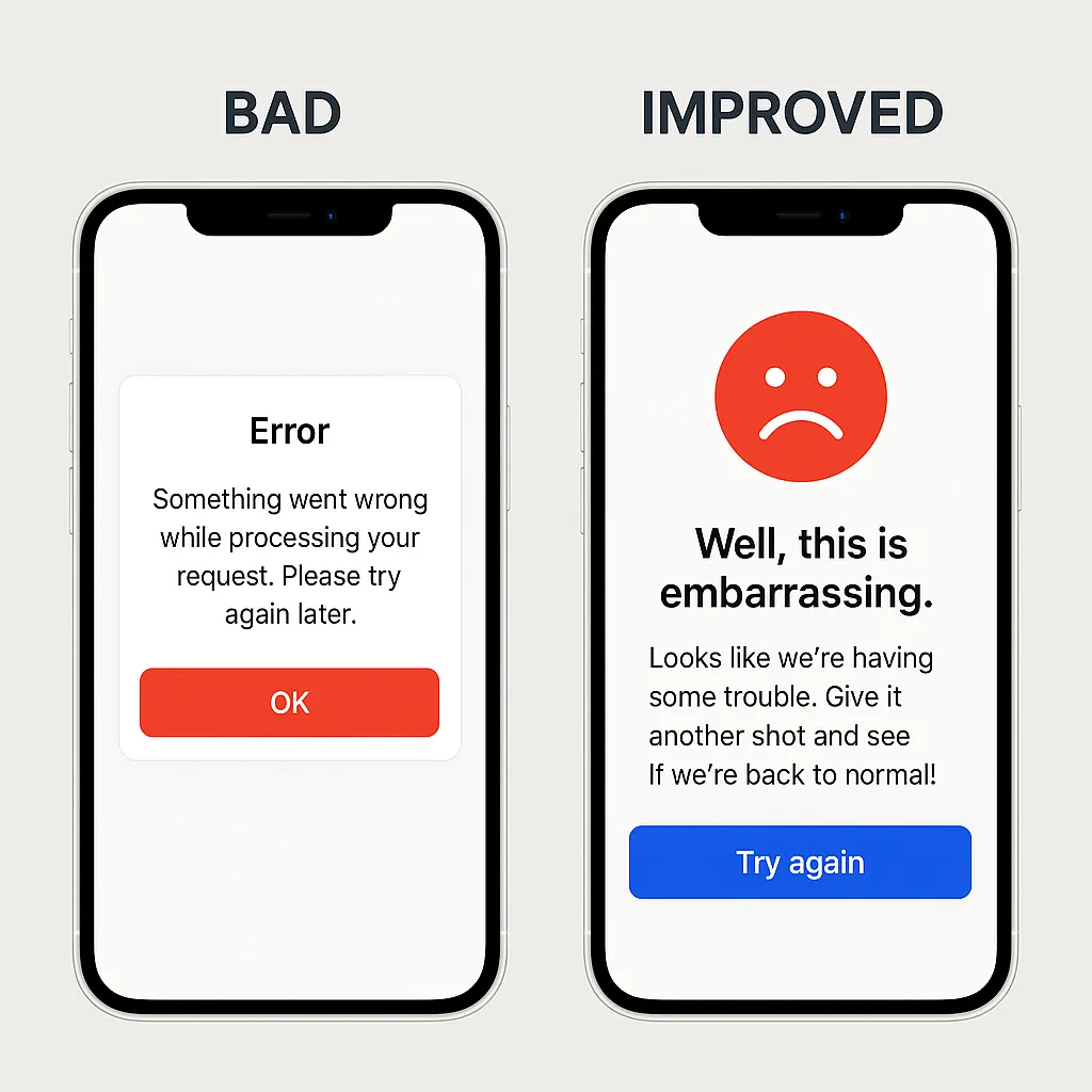
“If error, then user did something wrong.” That’s the attitude many apps unintentionally communicate. Generic messages like “Something went wrong” don’t help.
Alternative: Show clear, human messages. “Oops! Looks like your card expired. Tap here to update it.” Bonus points for humor—if it suits your brand voice.
5. Inconsistent Design Language Across Platforms
Here’s the thing—users often switch between their laptop and phone. If your fintech app feels totally different on web vs. mobile, you’re creating friction.
Best Practice: Stick to a unified design system. Keep fonts, icons, colors, and layouts consistent. Familiarity = confidence.
Relevant Entity: Think how PayPal or Wise ensures a seamless brand experience regardless of platform.
Why These Mistakes Hurt More in Fintech
Unlike food delivery or social apps, fintech products deal with people’s money. That means the stakes are higher. A confusing screen isn’t just frustrating—it feels risky. That’s why every interaction needs to be predictable, clear, and reassuring.
According to Statista, 70% of mobile banking users abandon apps due to poor navigation or design issues.
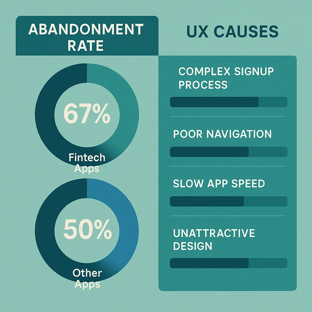
Examples of Fintech Apps Getting It Right (And Why)
- Revolut: Their clean UI and modular card layout make everything feel customizable without overwhelming.
- Chime: Focuses on simplicity, trust cues (like FDIC insurance upfront), and visual clarity.
- Cash App: Arguably the TikTok of fintech—smooth, fast, and focused on core actions.
Use them as inspiration. Learn from their flows, feedback systems, and simplicity.
Building It Right from Day One
If you’re planning to launch a neobank, P2P payment app, or digital wallet, don’t just clone a bank—clone the experience your users crave. UI/UX isn’t a last-mile concern; it’s the foundation.
And that’s where Miracuves comes in. From PayPal clones to Venmo-style wallet apps, we bake in modern design patterns, UX best practices, and user-tested flows—so your app feels native from the get-go.
Read more: How to Market a Digital Banking App Successfully After Launch
Final Thoughts
User trust isn’t earned through logos or taglines—it’s earned through delightful, consistent, and transparent experiences. Every tap, swipe, and scroll is an opportunity to build (or break) that trust.
Want to stay ahead of the curve? Keep an eye on AI-driven personalization, voice interfaces, and biometrics—because they’re not future trends anymore, they’re happening now.
At Miracuves, we help innovators launch high-performance app clones that are fast, scalable, and monetization-ready. Ready to turn your idea into reality? Let’s build together.
FAQs
Q:1 How important is UI/UX for fintech apps compared to other industries?
It’s critical. In fintech, bad UX doesn’t just cause friction—it triggers fear and mistrust. Unlike social media or games, mistakes feel financially risky.
Q:2 What are the top 3 UI/UX priorities for a new fintech app?
Keep it simple, show trust signals, and ensure instant feedback for every action. Think like a user, not just a developer.
Q:3 Should fintech apps use dark mode?
Yes—if your users want it. Offer it as an option, not a default. Many users now expect it for better readability and battery life.
Q:4 How can I test if my UI is user-friendly?
Use tools like Maze or UsabilityHub to run real tests. Better yet, give your prototype to a non-tech friend and watch how they use it.
Q:5 What’s a good onboarding benchmark for drop-off?
If more than 20% of users drop before finishing onboarding, something’s off. Simplify, clarify, and maybe even gamify the process.
Q:6 Can I fix a poor UI after launch?
Definitely—but it’s harder. That’s why starting with a great UX partner like Miracuves saves you time, money, and customer trust.
Related Articles: