
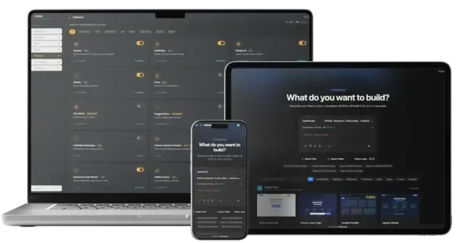

Let’s be real—launching a crypto project in 2025 isn’t for the faint of heart. The competition’s cutthroat, regulations are a moving target, and users? They’ve got the attention span of a caffeinated squirrel. Now toss in a decentralized launchpad with clunky UX, and boom—your token launch turns into a cautionary tale on Reddit.
We’ve all seen them. Crypto platforms where buttons hide like they’re playing tag, wallets sync after two lunar cycles, and onboarding feels like decoding an alien message. For startups and creators with big dreams and limited dev bandwidth, UI/UX is often the first thing that gets tossed out with the wireframe scraps. But that oversight? It’s burning trust, conversions, and community faster than gas fees during a meme coin frenzy. That’s why investing early in Custom crypto platform development is crucial—it aligns functionality with user expectations from day one.
So if you’re planning to build or revamp a decentralized crypto launchpad—or considering a Launchpad Clone Solution—you’ll want to avoid the pitfalls that tank even the most hyped Web3 projects. At Miracuves, we’ve seen how polished design drives adoption. Now let’s unpack where most launchpads go wrong—and how not to end up as another post-mortem thread.
Read more: What is BSCPad App and How Does It Work?
1. Overcomplicated Wallet Integration
The Mistake:
Forcing users to connect a wallet before they even know what the platform does. Or worse, supporting only MetaMask in a multi-chain world where wallets like Trust, Phantom, and WalletConnect are household names.
Why It Kills UX:
Users expect instant onboarding. If they hit a wall asking for permissions and popups they don’t yet trust, you’ve already lost them.
The Fix:
Implement a progressive disclosure model—let users explore before prompting wallet integration. Use WalletConnect and RainbowKit for broad compatibility. Highlight security via UI, not just technical jargon.

2. Jargon Overload: Are You Building for Humans or Bots?
The Mistake:
Drowning your UI in acronyms like IDO, KYC, TVL, and APR without onboarding explanations or tooltips. It’s like speaking fluent crypto in a noob’s first rodeo.
Why It Fails:
Not every user is a DeFi degenerate. Alienating them with unfamiliar terms makes your launchpad feel elitist.
The Fix:
Use layered UI communication—short, plain-language copy upfront, with expandable advanced sections. Microcopy and hover-to-explain tooltips help a lot.
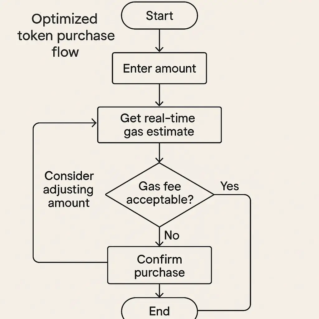
3. Clunky Token Purchase Flows
The Mistake:
Long, multi-screen token purchase processes with unclear error messages and zero transaction feedback.
Case in Point:
Imagine trying to buy tokens but not knowing if your transaction failed, succeeded, or vanished into the blockchain ether. It’s not just bad UX—it’s anxiety-inducing.
The Fix:
Use transactional UI patterns—show progress states (Pending → Confirmed → Done), clear error handling, and fallback options like retry or save for later.
4. Poor Mobile Responsiveness
The Mistake:
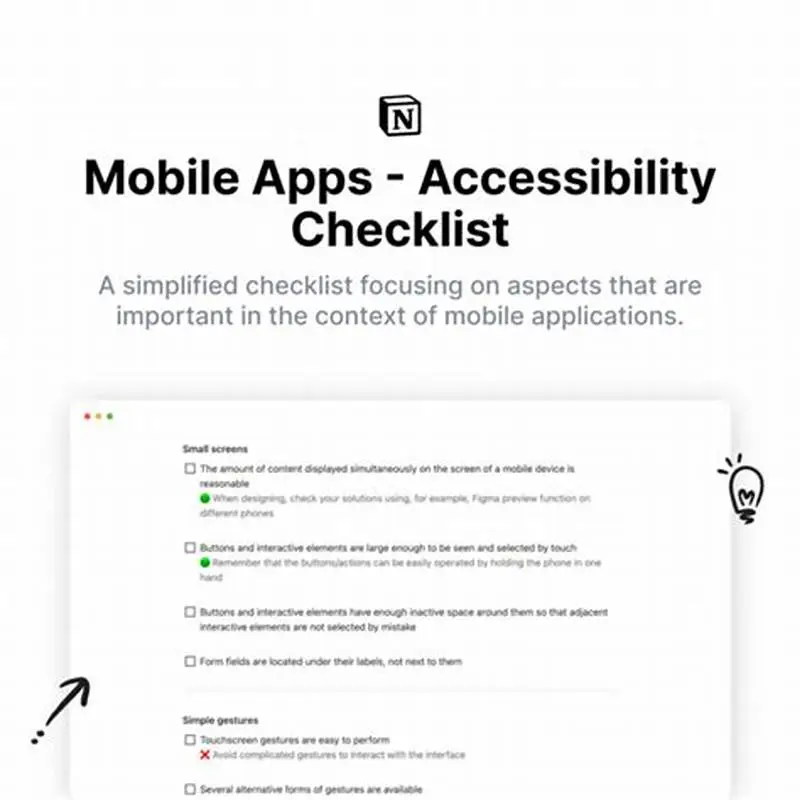
Designing only for desktop when 60–70% of traffic in crypto spaces comes from mobile-first users, especially in emerging markets.
Why It’s a Dealbreaker:
Try navigating a multi-tabbed dashboard on a 6-inch screen with wallet popups hijacking your browser. It’s rage-click city.
The Fix:
Design mobile-first, not just mobile-friendly. Use collapsible elements, larger touch zones, and mobile-specific flows for sign-in and wallet use.

5. KYC/AML Compliance as an Afterthought
The Mistake:
Burying KYC flows deep in the onboarding or making them janky add-ons that glitch out halfway.
Why It Backfires:
For regulated regions, compliance isn’t optional—and broken KYC flows are the #1 reason users abandon decentralized platforms.
The Fix:
Partner with KYC API providers (like Blockpass or Persona) and embed compliance into the user journey, not as a side quest.
6. Lack of Real-Time Feedback & Notifications
The Mistake:
Users trigger a transaction and… silence. No loader, no update, no “you’re in queue”—just eerie blockchain purgatory.
The Fix:
Use toast notifications, in-app banners, and push messages to confirm actions. Real-time UX builds trust, especially when gas is involved.
7. No Dark Mode or Accessibility Support
The Mistake:
White-background blindness and inaccessible color schemes that alienate users with visual impairments or just late-night DeFi enthusiasts.
The Fix:
Support theme toggling, increase color contrast ratios, and implement accessibility-friendly keyboard navigation and ARIA labels.
8. Tokenomics Visualization Is Either Too Complex or Nonexistent
The Mistake:
Dumping a PDF of tokenomics into the site or stuffing all data into a single dense chart that screams “data puke.”
The Fix:
Break down tokenomics with interactive sliders, allocation charts, and vesting timelines. Make your token strategy easy to digest visually.
9. No Social Proof or Community Signals
The Mistake:
Hiding user reviews, social metrics, or Discord/Telegram integrations. Web3 runs on trust by transparency.
The Fix:
Feature live participation numbers, audit verifications, and even on-chain badge systems. Users trust platforms that are clearly used by others.

Read more: Business Model for Decentralized IDO Launchpad: Make Crypto Projects Profitable
Conclusion
In the wild west of decentralized finance, your UI isn’t just a design element—it’s your first line of defense, your onboarding funnel, and your conversion engine. Get it wrong, and you’re bleeding users. Get it right, and you’re building a launchpad that rockets beyond moonshots.
Emerging trends like AI-enhanced UI, embedded wallet SDKs, and gamified onboarding are already reshaping how users interact with decentralized platforms.
At Miracuves, we help innovators launch high-performance app clones that are fast, scalable, and monetization-ready. Ready to turn your idea into reality? Let’s build together.
FAQs
Q:1 What’s the #1 UI mistake in most decentralized launchpads?
Forcing users to connect a wallet too early without offering context or value first. It kills engagement.
Q:2 Can a bad UX impact token sales directly?
Absolutely. Confusing flows and poor trust signals can reduce conversions, no matter how good your tokenomics are.
Q:3 Should I prioritize mobile or desktop design first?
Go mobile-first. That’s where most emerging-market users are engaging with Web3 platforms.
Q:4 Do I need KYC if it’s a decentralized platform?
If you’re operating in regulated regions or listing tokens with fiat onramps, then yes—KYC is non-negotiable.
Q:5 How important is dark mode in crypto apps?
Very. Not just for aesthetics—users expect it for nighttime use. It’s become table stakes in fintech and DeFi UI.
Q:6 Can Miracuves help with customizing a crypto launchpad?
Yes! Whether you’re building from scratch or customizing a Launchpad Clone, we’ve got you covered—from UI to scalability.
Related Articles:
- BSCPad Features List: What Makes It the Launchpad Every Crypto Project Dreams Of
- BSCpad App Marketing Strategy: Launchpads Don’t Launch Themselves
- What is a PinkSale App and How Does It Work?
- Top 5 Mistakes Startups Make When Building a Pinksale Clone
- Pinksale vs BSCpad Business Model | Guide for Web3 Startups
Miracuves is an independent software development company. We are not affiliated with, connected to, sponsored by, or endorsed by any company or product named in this article.
Terms such as “X Clone” are used descriptively. It is how the software industry refers to building a platform with functionality comparable to a known service, and how clients search for it.
The entire design and codebase of our products is built by our own team. Our products contain no code, design, graphics, or content originating from any third-party website or applications.
All third-party names and marks referenced in this article are the property of their respective owners, referenced solely to identify the services discussed.