
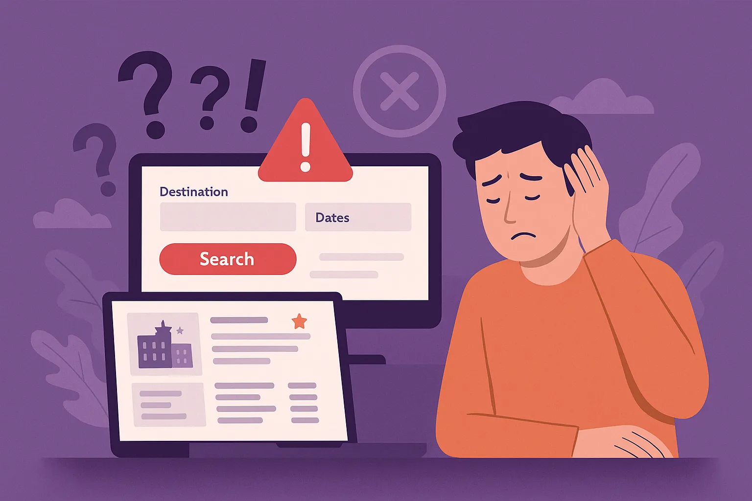
Ever booked a trip online only to feel like you just wrestled with a Rubik’s Cube blindfolded? You’re not alone. Clunky interfaces, hidden costs, and the dreaded “Oops! Something went wrong” message at checkout have sabotaged more travel dreams than flight cancellations ever could. For digital entrepreneurs and creators diving into the world of travel booking apps, designing a seamless user experience isn’t just a nice-to-have—it’s your bread and butter.
The truth is, users don’t want to think. They want to book. Fast. Whether they’re browsing last-minute deals from their smartphones or researching months in advance on a laptop, the UI/UX design should be guiding them, not tripping them up. A single bad interaction—slow loading screen, poor layout, or confusing calendar picker—can lead to app abandonment faster than you can say “Bon Voyage.” That’s why investing in a seamless online travel booking app solution is critical to keeping users engaged and converting.
At Miracuves, we’ve seen firsthand how overlooked design flaws can crush conversion rates in otherwise brilliant travel marketplace apps. So let’s pull back the curtain and break down the top UI/UX mistakes that might be killing your platform’s vibe—and what to do instead.
Read more: How to Start an Online Travel Booking and Agency Business
Overloading Users with Choices (The Paradox of Choice)
You know the feeling: 248 hotels in Goa, all “best-rated,” all offering “exclusive deals.” It’s like trying to choose your favorite ice cream flavor while drowning in 500 options. The Paradox of Choice is real—and it paralyzes users.
What Goes Wrong
- Endless scrolling with no smart filters.
- No personalization or relevance-based sorting.
- Hotel, flight, activity, taxi—all on one cluttered page.
What to Do Instead
Design smart defaults and layered filtering. Show users what’s most relevant based on location, season, or past behavior. Use collapsible filter panels and prioritization algorithms.
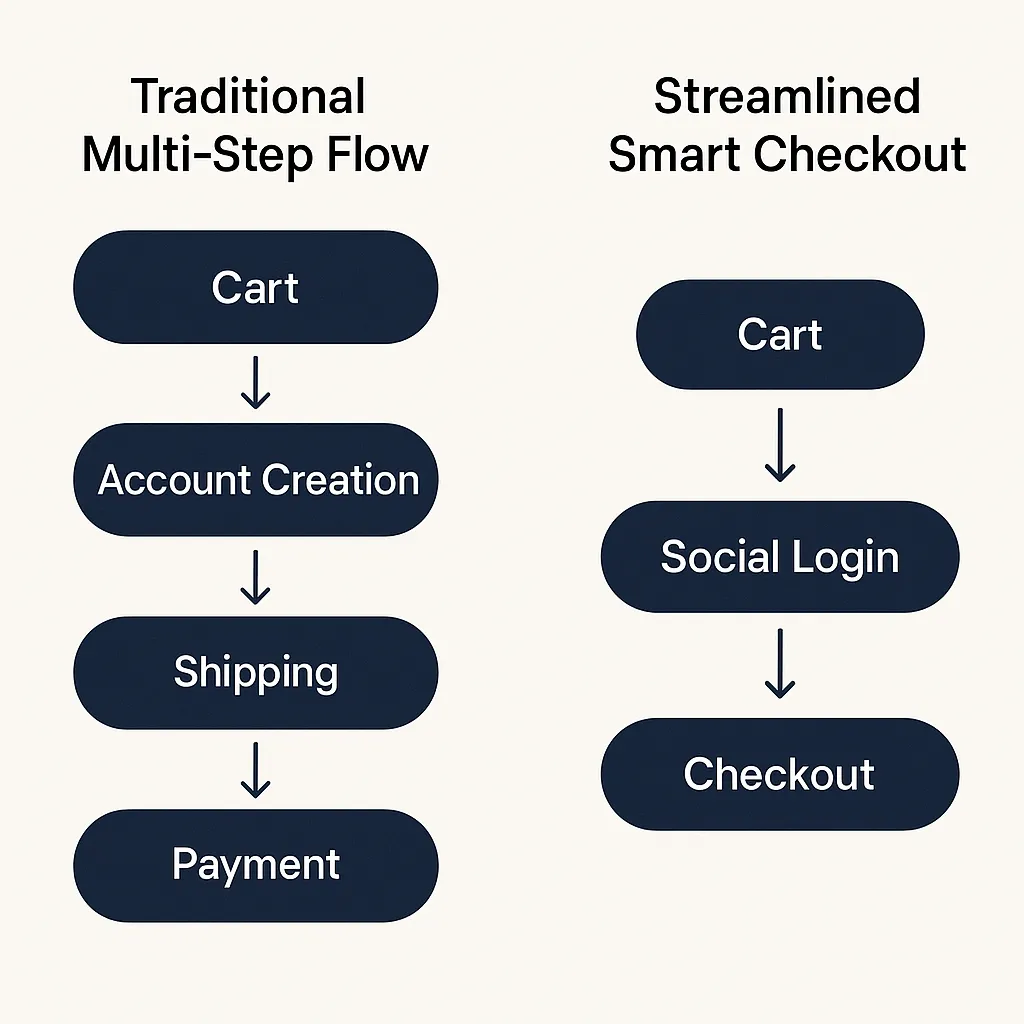
Painful Booking Flows (Too Many Clicks to Convert)
Ever counted how many clicks it takes to actually book something on some platforms? (Spoiler: it’s too many.) This one’s a conversion killer.
Common Sins
- Multi-step booking forms without progress indicators.
- Making users re-enter data for each service (e.g., flight + hotel).
- Lack of guest checkout or social login.
Design Fixes
- Use a unified booking engine with saved user preferences.
- Autofill, guest mode, and one-click repeat bookings are your friends.
- Employ visual progress bars and inline validation (no surprise errors at the end).
Poor Mobile Optimization
Here’s the kicker: over 65% of travel searches happen on mobile devices, but most booking platforms are still desktop-first. If your mobile UX feels like playing Jenga during an earthquake, you’ve already lost.
Symptoms
- Buttons too small to tap.
- Calendars that don’t fit the screen.
- Scroll-jacking and broken navigation bars.
What You Need
- Touch-friendly elements, adaptive grids, and collapsible nav.
- Optimized visuals (low-weight but high-res).
- Sticky CTAs (Call to Actions) on mobile—like a persistent “Book Now” button.
Hidden Fees and Surprise Pricing
Nothing breaks trust like hidden fees popping up at the last moment. Surprise service charges or unclear refund policies are a surefire way to increase churn.
UX Pitfalls
- Price breakdowns hidden behind extra clicks.
- Inconsistent pricing between search and checkout.
- Poor visibility on cancellation/refund options.
UX Remedies
- Transparent, upfront pricing with clear toggles for add-ons.
- Use of icons, tooltips, and plain language explanations.
- Highlight best value options—not just lowest price.
Lack of Trust Signals and Reviews
Trust is your currency. No one’s booking a €1,200 villa without knowing if the host cancels last minute or if it’s secretly located in a noisy back alley.
Common Flaws
- No guest reviews or host ratings.
- Generic photos instead of verified imagery.
- No badges or user-generated content.
Smart UX Moves
- Verified reviews, badges for hosts, and “top-rated” filters.
- Trust signals like “Secure Payment” and “Free Cancellation” icons.
- Use real user content—photos, experiences, video clips.
Inconsistent Design Language
A jarring mix of fonts, inconsistent icons, and Frankenstein-style layouts can make your platform feel… amateur.
What’s the Damage?
- Brand dilution and user confusion.
- Harder to form muscle memory for key tasks.
- Increased support tickets.
Fix It With
- A consistent, mobile-first design system.
- Style guide for color palettes, typefaces, and icon sets.
- Microcopy and tone of voice guidelines.
Neglecting Accessibility and Localization
A travel platform that doesn’t speak the user’s language—literally or functionally—isn’t going far.
Examples of Neglect
- No multilingual support.
- Inaccessible color contrasts and font sizes.
- No offline booking summaries or timezone adjustments.
Pro Tips
- Offer regional currencies, languages, and date formats.
- Ensure WCAG 2.1 compliance.
- Optimize for both high-speed and patchy networks (hello, airport Wi-Fi).
Read more: Essential Features of an OTA Platform and Their Development Costs
Conclusion
Creating a travel booking platform that feels intuitive, personal, and trustworthy isn’t rocket science—it’s user empathy. The devil’s in the (UI/UX) details. Streamline the journey, make trust the default, and reduce friction at every touchpoint.
Trends like AI personalization, voice search, and AR-powered previews are shaping the next wave of travel tech. But before you chase shiny objects, fix your fundamentals.
At Miracuves, we help innovators launch high-performance app clones that are fast, scalable, and monetization-ready. Ready to turn your idea into reality? Let’s build together.
FAQs
Q:1 How many steps should an ideal booking flow have?
Ideally, 3–5 steps max. Use visual indicators and minimize form fatigue with auto-fill and saved preferences.
Q:2 What’s the biggest UI mistake to avoid on mobile?
Tiny touch targets and overcrowded screens. Prioritize tap-friendly layouts and sticky action buttons.
Q:3 How important are user reviews in travel apps?
Crucial. They drive trust and conversions. Verified, visual reviews work best.
Q:4 Should I use a chatbot for support?
Only if it’s genuinely helpful. Bots should solve common queries fast—not act like digital gatekeepers.
Q:5 How do I make my platform more trustworthy?
Show pricing transparency, highlight security features, and use user-generated content. No surprises.
Q:6 What design trends are emerging in 2025?
Think voice-assisted bookings, AI-based itinerary builders, and ultra-minimalist designs that focus on speed.
Related Articles:
Miracuves is an independent software development company. We are not affiliated with, connected to, sponsored by, or endorsed by any company or product named in this article.
Terms such as “X Clone” are used descriptively. It is how the software industry refers to building a platform with functionality comparable to a known service, and how clients search for it.
The entire design and codebase of our products is built by our own team. Our products contain no code, design, graphics, or content originating from any third-party website or applications.
All third-party names and marks referenced in this article are the property of their respective owners, referenced solely to identify the services discussed.